Food Truck Logo Ideas and How to Make One Work at Every Size
Published by Avco Boxes, a custom pizza and bakery box manufacturer in Long Island, New York since 1989.
A good food truck logo is bold, simple and readable from across a street, and it still works when printed a few inches wide on a cup or a sheet of wrap paper. Strong directions include a truck silhouette, your hero dish as an icon, hand-lettered script, a retro badge, a block wordmark and a mascot. Plan a one-color version from the start.
10 food truck logo ideas
1. The truck silhouette
A side view of a truck or trailer says "mobile food" at a glance. The risk is that many trucks use one, so make yours specific: draw your actual vehicle's shape, whether that is a boxy step van, a rounded vintage trailer or a converted bus, and keep it to a few solid shapes. The service window can double as a frame for your name.
2. Your hero dish as the icon
If you are known for one thing, put it in the logo. A taco, a dumpling, a slice, a lobster roll or a bowl of noodles, simplified to a clean outline, tells people what you sell before they read a word. It also makes the menu decision easier for someone walking up for the first time. Draw the dish from its most recognizable angle and resist adding detail.
3. Hand-lettered script
Script lettering feels friendly and handmade, which suits a chef-owned truck. Pick a script with thick, even strokes, because thin hairlines disappear on a wrap seen from a distance and break up on small print. Pair it with a plain, sturdy typeface for secondary words like "Kitchen" or what you serve.
4. A retro badge
A circle, shield or roadside-sign shape holding your name and a short tagline gives a vintage, built-to-last feel. Badges fit neatly on a cup or the center of a bag. Keep text around the edge to a few words so it stays legible when the badge shrinks.
5. A bold block wordmark
Sometimes the best logo is just the name in heavy, wide capital letters. A block wordmark is the most readable option on a moving vehicle or in a crowded lot, and it prints cleanly at any size. Give it character through letter spacing, a single accent color or one customized letter.
6. A mascot
A character, such as an animal, a cartoon version of your dish or a stylized chef, gives a truck personality and appeals to families. Mascots tend to be detailed, so design a simplified head or face for small items and social media icons.
7. A road or wheel motif
A wheel, a road sign, a route-number shield or a winding road line can stand in for a letter or frame the name. These marks fit trucks that change locations often and want to lean into being on the move.
8. Cuisine cues, used with care
Patterns, colors and symbols tied to a food culture can signal what you cook. Be careful with clichés: sombreros, chopstick-shaped lettering and stereotyped characters can come across as lazy or disrespectful, and they make you look like every other truck. Specific, authentic details, such as the shape of a regional dish, a pattern from the owner's home city or the name of a family recipe, work better and tell a real story.
9. A local landmark
A bridge, a water tower, a skyline or a state outline ties the truck to its home base. Reduce it to its simplest outline so it reads at a glance.
10. A monogram or initials
One or two letters in a simple frame give you a compact mark for stickers, cup lids and app icons. Use it alongside your full name rather than in place of it.
Color ideas
- High-contrast pairs: black and yellow, navy and orange, red and cream, dark green and white. These hold up in bright sun and at a distance.
- Warm food colors: reds, oranges and golds suggest heat, grilling and comfort food, which is why so many trucks use them. Pair one with a dark neutral so you stand out.
- Fresh colors: greens, teals and light blues suit salads, smoothies, seafood and juice.
- Limit the palette. Two colors plus black or white is plenty. Every extra color is harder to match across a wrap, a menu board and printed packaging.
Whatever you pick, write down your exact color values so your wrap shop, sign maker and packaging printer all work from the same numbers.
One logo, three very different sizes
This is where most food truck logos succeed or fail. The same mark has to work on a vehicle several feet long, on a menu board at eye level and on a cup that fits in one hand. Test your design at all three before you commit.
The truck wrap
Your wrap is read from 50 feet or more away, often in passing, by someone deciding whether to cross the street.
- Use high contrast. Dark on light or light on dark, with nothing busy behind the name.
- Keep the words few. Your name, what you sell in two or three words, and maybe your social handle. Long taglines and full menus do not read at that distance.
- Make it big. The logo should be the largest element on the serving side, and repeated on the back and the opposite side so it reads in traffic.
- Work around the truck. Keep lettering clear of the service window, door seams, vents and handles, which can split letters apart.
The menu board
At the window, people read from a few feet away while standing in line. The logo is smaller here and shares space with prices and descriptions, so a horizontal or stacked version usually fits best. Keep it at the top, and let the menu itself carry most of the board.
Small items: wrap paper, cups and bags
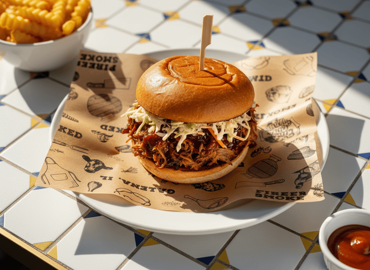
Packaging prints your logo just a few inches wide, and it is the version people carry back to the office and photograph. This is the hardest size to get right.
- Have a one-color version. Many packaging runs print in a single ink. If your logo depends on a gradient or three colors to make sense, it will lose its shape.
- Use bold shapes. Solid areas and thick strokes survive. Fine lines, small outlines and tiny text fill in or break up on paper.
- Drop the extras. A tagline or a detailed illustration that looks good on the truck may need to be removed at this size. A compact icon or stacked name often works better.
- Plan for white and kraft. On white paper, most colors print true. On brown kraft, dark inks such as black, navy or deep green read best, while light colors and thin lines fade into the background.
A simple test: print your logo about two inches wide on plain paper, step back a few feet and see if you can still tell what it is.
Get vector files from your designer
Ask for your logo in vector formats: AI, EPS, SVG or PDF. Vector artwork is built from shapes rather than pixels, so it scales from a full truck wrap down to a cup without going blurry. A JPG or PNG pulled from social media will not hold up when enlarged for a wrap and may not print crisply on packaging either.
Make sure you also get the full-color version, a one-color version, a horizontal and a stacked layout, and a list of your color values. Our guide to preparing artwork for custom packaging covers fonts, file types and what to check on a proof.
Before you finalize
- Settle your name first. If you are still deciding, our food truck name ideas post has lists and a simple way to choose.
- Mock the logo onto a photo of your truck, a menu board and a cup.
- Check it in one color, on white and on kraft.
- Show it to a few people for a few seconds and ask what you sell. If they cannot tell, simplify.
For the bigger picture on getting rolling, see how to start a food truck.
Put your logo on your packaging
Once the logo is ready, packaging is how it travels beyond the truck. Our custom wax paper and wrap papers carry your mark around burritos, sandwiches and burgers, and the food truck and mobile vendor collection brings together cups, bags and wraps sized for small operations. If you are not sure what to brand first, read branded packaging for food trucks. Every order includes a free digital proof, a $75 one-time artwork setup and production in 7–10 business days after approval, all made in the USA.