Bakery Logo Ideas: 10 Concepts and How to Make Them Work
Published by Avco Boxes, a custom pizza and bakery box manufacturer in Long Island, New York since 1989.
A strong bakery logo is simple, readable at small sizes and tied to what you bake. Popular directions include a wheat stalk, a rolling pin or whisk, a croissant or loaf silhouette, a script wordmark, a vintage badge with your opening year and a minimalist monogram. Whichever you pick, make sure it prints cleanly in one color on a cake box, a cookie bag and a sticker.
10 bakery logo ideas
These are concepts described in words, so you or your designer can sketch your own version instead of copying a template. Most bakeries end up combining two of them, such as a script name with a small wheat icon.
1. Wheat stalk
A single stalk or a pair of crossed stalks is the most recognizable sign for bread. It suits a bakehouse focused on loaves, sourdough or whole grains. Keep the stalk to a few clean shapes; a detailed drawing with every grain looks muddy when it is shrunk onto a bag.
2. Rolling pin or whisk
Tools say "made here, by hand." A rolling pin laid under the name works like an underline, and a whisk can stand in for a letter such as an "I" or an "L." Two crossed tools inside a circle make a tidy stamp for stickers and box seals.
3. Croissant or loaf silhouette
A solid outline of your signature item tells people what you are known for. A croissant reads as French or pastry-led, a round boule reads as artisan bread, and a braided loaf suggests challah or holiday baking. Silhouettes work well because they stay recognizable at any size and in one color.
4. Script wordmark
Your name in a flowing script, with no icon at all. Script feels personal and warm, and it suits cake studios and family bakeries. The risk is legibility: thin strokes and tight loops disappear on kraft paper and at small sizes. Choose a script with sturdy strokes, and test it at one inch wide before you commit.
5. Vintage badge with est. year
A round or shield-shaped badge with your name across the middle, "Bakery" or "Bake Shop" below, and "Est. 2026" or your founding year in small type. Badges look established even for a new shop, and they fit naturally on a round sticker or the center of a box lid. Keep the ring of text short so it stays readable.
6. Hand-drawn mark
Loose, sketch-style lettering or a doodled pastry gives a friendly, neighborhood feel. It works for cafes and bakeries that want to look approachable rather than formal. Have the final version redrawn or traced as clean vector shapes, so the "hand-drawn" look survives printing without fuzzy edges.
7. Minimalist monogram
One or two initials in a clean typeface, sometimes inside a circle or square. A monogram is ideal as a secondary mark for small items: the top of a cookie bag, a sticker sealing a pastry box or a stamp on wax paper. Pair it with your full name for larger surfaces.
8. Cupcake or layered cake
For cake shops and cupcake bakeries, a simple cupcake or a tiered cake silhouette sets expectations right away. Avoid stacking too many details (sprinkles, candles, swirls) into a tiny icon. A clear outline of the frosting swirl is usually enough.
9. Oven or hearth shape
An arched oven door or a simple hearth outline framing the name suggests baking from scratch and fits wood-fired or bread-focused shops. The arch also gives you a natural shape for a window decal or the top of a menu board.
10. Ingredient icon
Build the mark around one ingredient you are known for: a lemon for a citrus-forward pastry shop, a honey dipper, a cinnamon stick, an egg or a cocoa pod. This works best when the ingredient also appears in your name or your best-selling item.
Bakery color palette ideas
Color does a lot of the work in a bakery logo. Pick one main color and one accent, and make sure the logo still works in the main color alone.
| Palette | Feel | Best for |
|---|---|---|
| Cream and warm brown | Classic, toasty, traditional | Bread bakeries, bakehouses, cafes |
| Pastels (blush, mint, butter yellow) | Sweet, soft, celebratory | Cupcakes, cake studios, macarons |
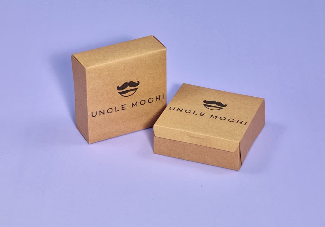
| Black on kraft | Rustic, modern, honest | Sourdough, artisan and minimalist shops |
| Deep green or navy with cream | Premium, calm, established | Pastry shops, patisseries |
| Red or terracotta with white | Bold, energetic, easy to spot | Busy counters, donut and cookie shops |
If your packaging will be brown kraft, test your palette on kraft early. Pastels and light colors look much paler on brown board than on white, while black, dark brown, navy and deep green stay crisp.
How a bakery logo has to work on packaging
Most people will see your logo on a box or bag far more often than on your website. A logo that looks great on a large screen can fall apart on a cookie bag. Before you finalize, check it against these real uses.
On a cake box lid
The lid is your biggest canvas. A centered logo with your name large and a short line such as your neighborhood, phone number or website below it is usually all you need. Leave space around the logo so it does not crowd the edges or the fold lines. The cake box sizes guide helps you picture how much room each lid offers.
On a small cookie bag
A small pouch has only a few inches of print area. Long names shrink until the letters blur, and fine lines fill in. This is where a monogram, a badge or a short version of your name earns its place. If your full logo is wide, design a stacked or compact version for small items.
On a sticker
Round stickers are a low-cost way to seal stock boxes and bags. A badge or monogram fits a circle naturally; a long horizontal wordmark does not. Make sure the logo still reads at roughly one and a half inches across.
On a sign
Signs are seen from across the street, so bold shapes and thick strokes matter. A script with hairline strokes may be pretty on a business card and unreadable on a storefront. Use the same logo, just larger, so the sign and the packaging look like one brand.
Checklist before you finalize your logo
- One-color version. Have a version that works in a single color, in black and in white. Many packaging runs print in one ink, and you will need it for stamps, stickers and receipts.
- Readable small. Print the logo at one inch wide and look at it from arm's length. If you cannot read the name, simplify it.
- Works on kraft and white. Print a test on brown paper and on white paper. Check that light colors and thin lines still show on kraft.
- Horizontal and stacked layouts. A wide version for lids and signs, and a compact version for bags, cups and stickers.
- Vector files. Ask your designer for the final logo as vector files (AI, EPS, SVG or a vector PDF), with fonts converted to outlines. Vector art scales to any size without blurring, which is what printers need.
- Clear color references. Write down your exact colors, ideally as Pantone references, so every printed item matches.
- Fits your name. The icon and style should match what you sell. If you are still choosing a name, start with our bakery name ideas, since a short name makes logo design much easier.
Common bakery logo mistakes
- Too much detail. A realistic illustration of a full pastry case will not survive a small bag.
- Too many fonts. Two typefaces are plenty: one for the name and one for supporting text.
- Relying on gradients or photos. Gradients and photo effects are hard to reproduce on corrugated board and paper. Flat colors print more consistently.
- Using stock clip art. A generic cupcake icon may also appear on a competitor's sign. Even a simple custom mark is more memorable.
- Only having a low-resolution file. A logo saved from social media is too small to print well. Keep the original vector files somewhere safe.
Put your bakery logo on your packaging
Once your logo is ready, packaging is where customers will see it most. Our custom bakery boxes come in 24 sizes for cakes, pies and pastries, and custom cookie & bakery bags carry your mark on smaller items. Our guide to preparing artwork explains which files to send.
Every order includes a free digital proof, so you can see your logo on the box before anything is printed. There is a $75 one-time artwork setup per order, production takes 7–10 business days after proof approval, and everything is made in the USA.